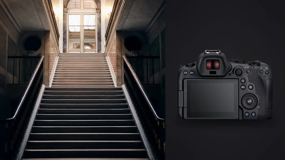
A friend who designs kitchens spent two years asking me to shoot her finished projects before I finally said yes, and it wasn't modesty holding me back. I didn't trust myself to get the materials right: the exact walnut stain she'd fought a supplier over for three weeks, the brushed brass that reads gold under one bulb and slightly green under another. When I picked up a Canon EOS R6 Mark II, for a completely different reason at the time, it turned out to solve more of that problem than I expected. Not because of one headline spec, but because of how a handful of smaller things line up when your client isn't a real estate agent who wants a room to look big and bright, but a designer who wants the exact swatch she chose off a supplier's sample board to read true on a laptop screen three states away.
Why a design portfolio shoot is a different job than a listing shoot
Real estate photography and interior design photography look similar from across the room, wide lens, bright windows, a hallway with good bones, but the brief underneath is not the same job. A listing shoot wants a room to feel large, neutral, and welcoming to a stranger who's never been inside. A design portfolio shoot wants the room to look exactly like what the designer built, down to the grain direction on a piece of custom millwork, because the client reviewing that gallery already knows the space and is checking whether you captured it honestly. That changes the pace. Instead of one hero wide shot and moving on, a design job means a wide establishing frame, then three to six detail shots per room: the hardware, the tile edge where two materials meet, a styled vignette on a console table that took the stylist twenty minutes to arrange.
None of that shows up on a spec sheet, but it changes what you actually need from the camera. Ultra-wide reach and buffer depth matter less here than color rendition under mixed light and autofocus that locks onto a small, specific object rather than the largest thing in frame.
Getting the color right before Lightroom ever opens
Most rooms in a finished design project are lit by at least three different color temperatures at once: daylight through a window, warm brass sconces running around 2700K, and cooler LED recessed cans somewhere near 4000K, all falling across the same countertop. Auto white balance on any camera will average that into something plausible but wrong, and "plausible" is exactly what gets flagged when a designer compares your file against the actual paint chip sitting on her desk. What changed my results wasn't a setting buried in a menu, it was discipline: I meter and set custom white balance off a grey card held in the specific light hitting the hero material, not the room's overall average, then hold that white balance for every frame in that setup rather than trusting the camera to adjust automatically between the wide shot and the detail shot two feet away.
The R6 Mark II's 14-bit RAW files give enough color depth that fine gradients in a fabric weave or a stone's veining don't band or posterize once you start pulling a curve to match a swatch, which matters more here than dynamic range headroom does. I still occasionally miss a cast, usually from a floor lamp with an off-spec bulb the electrician swapped in without telling anyone, but starting from a deliberate white balance instead of an averaged auto guess cuts the corrections I make later down to small nudges instead of full relights.
| Material or finish | Common color problem | How I handle it |
|---|---|---|
| Brushed brass hardware | Reads warm gold under incandescent, greenish under some LEDs | Custom white balance off a card held at the fixture, not the room average |
| Deep velvet upholstery (navy, emerald) | Loses weave texture in shadow, blues shift purple at higher ISO | Base ISO 100, meter for the fabric specifically, light it from the side to keep texture visible |
| Matte black plumbing and hardware | Falls flat with no dimension under even, frontal light | A small flag or raking side light to catch the finish without creating a hot spot |
| Polished marble or quartz counters | Mirrors ceiling fixtures and the camera rig straight back into the lens | Shoot from a steeper angle or use a polarizer, clone out any small rig ghost in post |
| Sheer or heavily textured drapery | Backlight from a window blows the weave detail to white | Expose for the fabric and let the window overexpose, bracket only if the view outside matters |
Reflections are the real enemy, more than distortion
On an architecture-focused shoot, converging verticals and lens distortion get most of the attention. On a design-focused shoot, I spend more time fighting reflections than lines. Polished stone, glass cabinet fronts, glossy tile, and lacquered furniture all mirror whatever is pointed at them, which on a set is usually a softbox, a ceiling can light, or the photographer. A circular polarizer earns its place in the bag here in a way it rarely does for a plain wide room shot, cutting glare off stone and glass enough to show the actual material instead of a blown-out reflection of the room's own lighting. When a polarizer isn't enough, which is often true on a marble island under three overhead cans, I'll reposition the tripod a few degrees rather than fight it with filters, since a steeper or shallower angle usually finds a spot where nothing hot lands directly in the reflection.
Detail shots are where autofocus earns its keep
Dual Pixel AF II is more precision than most rooms need for a wide establishing shot, but it matters a lot on the close, styled detail shots that make up half a design portfolio: a stack of ceramics on an open shelf, a drawer pull against grain-matched cabinetry, a folded throw on the arm of a chair. These are close-focus, shallow depth of field compositions where the camera needs to lock onto one specific small surface rather than defaulting to the largest or nearest object in frame, and I found myself switching from the wider subject-tracking modes to a single small AF point more often on these shots than on any wide room composition. It's slower to work this way, but on a styled vignette where the designer wants the eye landing on one particular ceramic bowl and not the plant behind it, a single deliberate point beats letting the camera decide.
Working the room with a stylist and a nervous client
A full reveal shoot rarely happens with just a photographer in the room. There's usually a stylist adjusting throw pillows between frames and often the designer herself, standing just out of frame, checking that six months of sourcing looks the way she pictured it. I tether to a tablet for most of these jobs now, not for technical review but so the designer can see a composition before I move to the next setup, since a styling adjustment is much cheaper to make in the moment than after everyone's packed up and the furniture rental truck has come back for the props. The R6 II's fully silent electronic shutter mode gets used constantly here too, letting the stylist keep working two feet away, moving a vase or fluffing a cushion, without a shutter clack turning every adjustment into an interruption.
What a full reveal shoot actually produces
A finished house with eight or nine rooms, one wide shot per room plus four or five detail and styled vignette shots each, adds up fast, usually somewhere between 500 and 750 RAW frames by the time the stylist starts breaking down props. A meaningful chunk of that is near-duplicate: the same drawer pull shot from three slightly different angles while the stylist debated which one read best, or a styled tablescape reshot twice because a plant leaf was in the wrong spot the first time. Sorting that by eye at the end of a ten-hour shoot day is exactly the kind of work that makes you sloppy, and sloppy culling on a design job means the wrong near-duplicate detail shot ends up in a client's press kit.
I run the card through imagic before I open anything in an editor. Its duplicate and burst clustering groups those repeated hardware and vignette shots together automatically instead of leaving five nearly identical brass pull photos scattered across a flat grid, and the local sharpness scoring flags which frame in each small group is actually the sharpest, which matters more than it sounds like on handheld detail shots taken at a wide aperture where focus can drift half an inch between takes. I've also trained the apply_my_style preset on a set of my own finished design edits, warm but not orange, restrained saturation, shadows that hold detail rather than going inky, so a new import already leans toward the look I want instead of a flat, generic starting point I'd otherwise correct room by room. Since it all runs locally rather than through a cloud queue, it's also a straightforward yes when anyone asks whether an unreleased reveal, one that's embargoed until a press feature or an awards submission goes live, is staying off third-party servers. For anyone whose culling is still the slowest part of shoot day, the general habits in this rundown on faster photo workflow pair well with camera-specific choices like the ones above.
Delivering a gallery a design studio can actually use
Real estate delivery is mostly one format: web-sized JPEGs sorted by room. A design studio wants several different things out of the same shoot: full-resolution files for a press kit, a curated square-crop set for Instagram that won't need cropping by an intern later, and a handful of hero spreads sized for a print portfolio book. Because dual UHS-II card slots let me shoot a full backup during the shoot itself, I'm not re-scanning a single card at 2am worrying about a corrupted file being the only copy of a scene that will not look the same again. Grading consistency across all of those different output sizes matters too, since a warm, slightly desaturated look that reads well as a magazine spread can look muddy cropped square for a phone screen, and getting a color grade that holds up across formats is worth reading up on separately if it's not already part of your process, which is exactly what this guide to color grading gets into in more depth than fits here.
Frequently Asked Questions
Does the R6 II's color straight out of camera actually match a designer's real paint and fabric choices?
Close, but not close enough to skip custom white balance. Auto white balance handles a single, evenly lit room reasonably well, but most design interiors mix daylight, warm sconces, and cooler recessed LEDs in the same frame, which auto white balance averages rather than resolves. Metering off a grey card in the specific light hitting the hero material and holding that setting through the whole setup gets me much closer than trusting the camera's guess.
How do you avoid reflections in glossy tile, marble, and brass without retouching every single frame?
Mostly by changing camera angle before reaching for a filter or a retouch brush. A circular polarizer helps on stone and glass, but a few degrees of tripod repositioning usually finds an angle where the ceiling lights or my own rig aren't landing directly in the reflection, which saves far more retouching time than fixing it after the fact.
What's actually different about shooting a design portfolio versus the same room for a real estate listing?
Volume and intent, mainly. A listing shoot wants one confident wide shot per room and moves on fast. A design portfolio shoot wants that same wide shot plus several close, styled detail frames per room, because the client is evaluating whether specific material and styling choices read correctly, not just whether the room looks spacious to a stranger.
Do you need a second shooter or an assistant for a full design reveal?
Not for the shooting itself, since one person can run camera and tripod fine, but having a stylist on set is close to mandatory once you're doing more than a handful of rooms. Someone needs to be actively adjusting props and fabric between frames while you're focused on light and composition, and trying to do both jobs solo slows a full-day reveal down considerably.