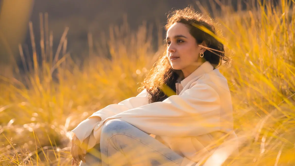
"Vibe editing" is a loose label for editing toward a felt atmosphere rather than copying a named film stock or applying a fixed preset. That can be useful language during a creative brief, but it becomes unreliable when mood is the only instruction. Warm, cinematic, nostalgic, clean, and moody mean different things to different people. A production workflow needs to translate those words into visible relationships that can be repeated across changing light.
The practical version of vibe editing is not a one-click effect. It separates correction from expression, defines a small number of color and tonal rules, adapts them to each scene, and judges the finished sequence as a whole. AI-assisted or learned styles can prepare a starting point, but authorship remains in the choice of references, exceptions, and final frame order.
Convert mood words into observable choices
Begin with three to five reference images that belong to the same intended world. They can come from the photographer's approved archive, a client treatment, cinema stills used lawfully for discussion, paintings, design, or location scouting. Identify what is shared: contrast shape, highlight color, shadow neutrality, skin placement, saturation hierarchy, black point, texture, and the balance between local and global color.
Replace broad adjectives with instructions that can survive a handoff. "Warm" might mean neutral whites with warm highlights, not an orange global white balance. "Soft" might mean compressed highlight contrast and restrained microcontrast, not blurred detail. "Nostalgic" might mean muted secondary colors, gentle black lift, and visible grain, not inaccurate skin. The more precise description gives an editor room to adapt without losing direction.
Also record what the look must not do. Skin must not drift green, white products must remain identifiable, black clothing must retain separation, and a night scene must still feel like night. Negative boundaries are often more useful than a long list of desired effects.
Correct capture variables before building character
A style cannot be evaluated while exposure and white balance are jumping randomly. Establish a neutral-enough base for each lighting family. Correct obvious exposure error, choose a camera profile or rendering baseline, address lens behavior where appropriate, and set white balance from known surfaces, references, and visual intent. This does not require making every frame clinically neutral. It creates a stable point from which creative movement can be judged.
Group images by scene and light source. Window daylight, open shade, warm interior lamps, mixed LED, flash, and night street light should not receive an identical correction. A fixed preset may add the same shadow tint to all of them, but the visible result will differ because the input colors differ. Scene-level normalization lets the creative layer behave more consistently.
Check difficult subjects early. Skin, white fabric, saturated flowers, branded products, and deep neutral objects expose unwanted casts quickly. If the intended look breaks those anchors, adjust the method before applying it across the full set.
Build the look from a small hierarchy
Define the tonal structure first: where black begins, how quickly shadows separate, where midtone contrast sits, and how highlights roll toward white. Then define color hierarchy. Choose which hue family leads, which colors support it, and which colors should recede. Finally decide texture, sharpening, grain, and local emphasis. This order reduces the chance that a color move is used to disguise a tonal problem.
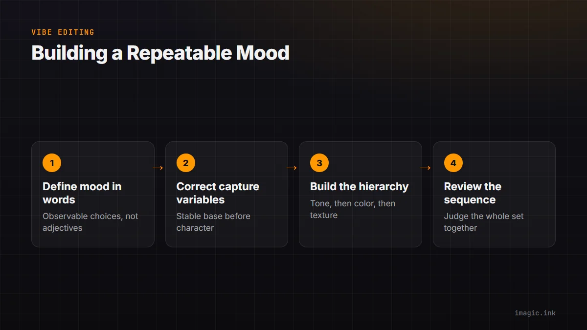
A useful style sheet can fit in a short table. It should express ranges and priorities rather than fixed slider numbers because applications and scenes differ.
| Layer | Creative decision | Failure to watch |
|---|---|---|
| Tone | Moderate midtone contrast with open dark detail | Gray blacks or clipped highlights |
| Temperature | Warm light, credible neutral objects | Global orange cast |
| Color hierarchy | Skin and one accent color lead | Every color equally saturated |
| Texture | Visible detail without brittle edges | Halos, plastic skin, noisy shadows |
| Exceptions | Night and mixed light retain their identity | All scenes forced into daylight color |
The table gives an assistant or future editor a testable direction. It also reveals when two desired traits conflict. Lifted blacks and deep contrast, for example, need a stated priority rather than simultaneous extreme settings.
Know why a static preset breaks
A preset stores a set of instructions. It does not understand why an image is underexposed, whether a yellow area is skin or a wall, or whether a blue shadow is atmospheric or accidental. The same curve can be elegant on soft daylight and destructive on a dim, high-contrast reception. The same saturation move can control foliage in one scene and damage clothing in another.
Presets remain useful as controlled starting points. Build variants for distinct lighting families, keep exposure and white balance outside the creative preset where practical, and preview on representative files. Name versions by purpose, not by vague emotion. "Daylight soft contrast" is easier to audit than "dream 07."
Do not stack unknown preset packs. Hidden profile changes, curve moves, calibration shifts, and local defaults can interact unpredictably. If a look depends on several stages, document their order and retain a clean baseline for comparison.
Use learned style as an adaptable first pass
A learned style can infer patterns from photographs the user has edited and apply a related starting treatment to new images. Its value is adaptation: unlike one fixed set of numbers, the starting adjustment can respond to differences between inputs. It is still bounded by the quality and relevance of the training examples, and it cannot decide the creative brief independently.
imagic documents two ways to build a user's style profile: learning from an edited library or matching supplied examples. get_style_profile can confirm whether a profile exists, and apply_my_style applies it to selected photo IDs. If no profile exists, applying a personal style is not a valid step; calibration or learning must come first. The style belongs to the user rather than being represented as a generic preset.
Curate examples by finished intent. Exclude accidental edits, experimental outliers, mixed client brands, and files with unresolved white balance. If the desired style has separate daylight and night expressions, either teach that diversity deliberately or maintain separate, clearly named approaches. Review new edge cases rather than assuming more examples always improve the result.
Keep culling separate from grading preference
It is easy to prefer a frame because a temporary grade flatters it, even when another frame has better gesture, focus, or composition. Perform the technical and narrative cull on a stable rendering first. Group near-duplicates, choose the meaningful moment, then evaluate how the selected set responds to the style.
imagic's culling flow analyzes sharpness, exposure, closed eyes, composition, and near-duplicate or burst relationships locally. It changes photo status without deleting original files. The photographer should still protect intentional blur, unusual framing, emotional reactions, and other exceptions whose value is not captured by a technical score.
Once selects are stable, apply the starting style and compare neighboring frames. If one frame needs a large rescue that the alternatives do not, confirm that its story value justifies the extra work. This keeps the final look from hiding weak selection.
Review the sequence at three scales
At thumbnail scale, inspect rhythm, color blocks, repeated compositions, and abrupt exposure changes. A gallery can be individually attractive yet feel incoherent when every third image shifts to a different palette. At normal viewing size, inspect faces, local contrast, background color, and the relationship between subject and environment. At close scale, inspect noise, sharpening, masks, edge halos, dust, and retouching.
Use a small set of anchor images. Choose one daylight portrait, one dark scene, one saturated scene, one neutral object, and one difficult mixed-light frame. Compare revisions against these anchors. An adjustment that improves one hero frame but breaks two anchors should become a local exception, not a global style change.
Sequence review also helps control trend excess. Grain, bloom, color crossover, and heavy black lift may look compelling on a single social frame but exhausting across a complete wedding, editorial, or product set. The intended delivery length should influence effect intensity.
Protect identity, consent, and documentary meaning
A vibe is not permission to change a person's body, skin identity, age, or expression without consent. Generative replacement and aggressive retouching should follow the brief and the ethical standards of the genre. Documentary and news photographs require special care because atmospheric edits can alter perceived time, danger, or environmental conditions.
Keep originals, non-destructive edits, and final exports distinct. Record substantial generated or composited changes when provenance or client policy requires it. Avoid presenting an AI-assisted aesthetic as the unmediated appearance of a place or event when that distinction matters.
For sensitive material, choose tools whose data path matches consent and contract. Local processing can reduce external exposure, but workstation security and backup still matter. The local desktop workflow provides one approach, while the AI and Technology section covers wider questions about automation and authorship.
Write a reusable style brief
Finish by storing the reference set, tonal description, color hierarchy, protected subjects, exception rules, output conditions, and approved anchor exports. Version the brief when the look changes. Do not silently overwrite the only description of a client style, because later jobs may need continuity with an earlier campaign.
A successful vibe-editing workflow produces recognition without sameness. Daylight still feels like daylight, night retains depth, skin remains credible, and each image serves its scene while belonging to the set. The mood becomes repeatable because its decisions are explicit, not because every file receives identical values.
Judge the vibe in the intended viewing conditions
A grade made on an uncalibrated bright display can become too dark in print or too aggressive on an ordinary phone. Set a controlled display brightness, use an appropriate monitor profile, and disable changing ambient-light features during critical review. Compare against a neutral reference and inspect shadow separation rather than trusting familiarity with the screen.
Create proof exports for the actual destinations: a color-managed master, a web derivative, and a print proof when print is part of delivery. Check whether compression, smaller dimensions, paper, or an application with weak color management changes the intended warmth, black point, grain, or subtle color crossover. A look that survives only inside the editing application is not production-ready.
Ask the approver to review the same anchor images under a stated condition before requesting broad changes. If feedback comes from a night-shift display or an unknown profile, confirm the issue on a trusted reference. The style brief should name the approved output, because one global grade cannot be optimized independently for every medium.
Frequently asked questions
Is vibe editing just another name for using presets?
No. A preset can be one starting component, but a dependable workflow also normalizes scenes, defines visual boundaries, handles exceptions, and reviews the whole sequence.
How many reference images are needed to define a look?
A small coherent set is more useful than a large contradictory board. Begin with three to five references, then add only examples that clarify a missing lighting or subject condition.
Can a learned style finish every image automatically?
No. It can provide an adaptive starting point based on the user's prior edits, but difficult light, masks, retouching, narrative exceptions, and final approval still need human judgment.