Color space confusion causes a very specific, very avoidable problem: a photo that looks rich and saturated on your editing screen arrives dull and flat once a client opens it on their phone. The fix is not more editing. It is picking the right color space at export, and understanding why it matters takes less time than most explanations make it seem.
Who Sees What, Where
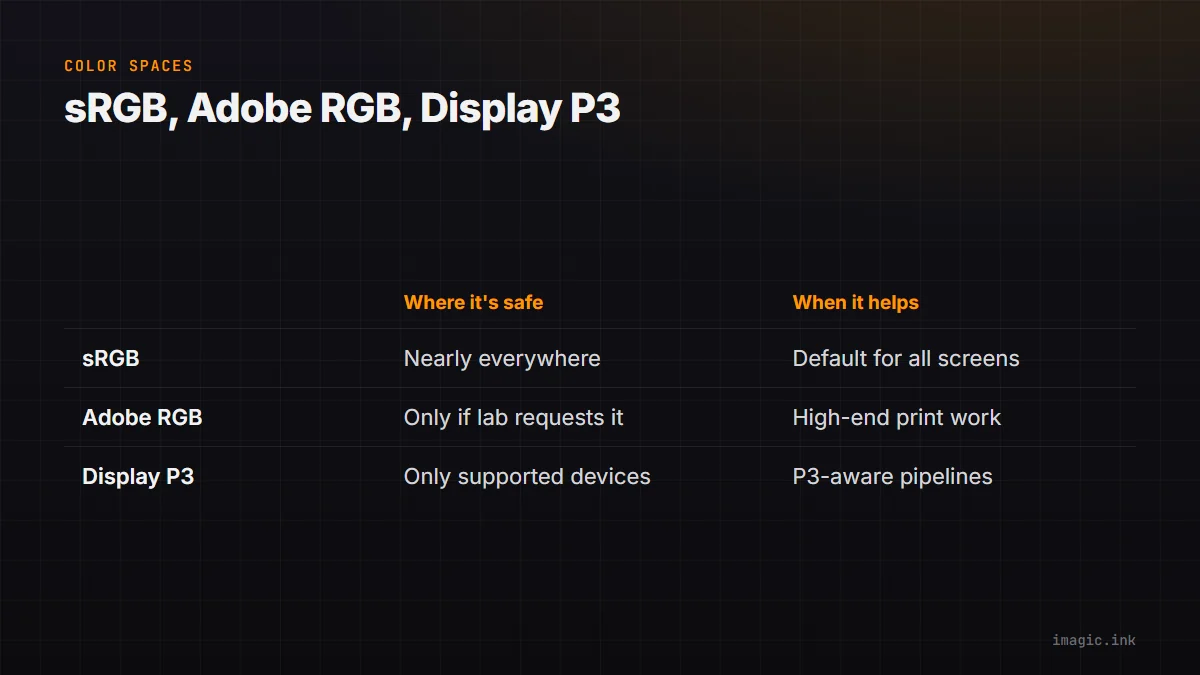
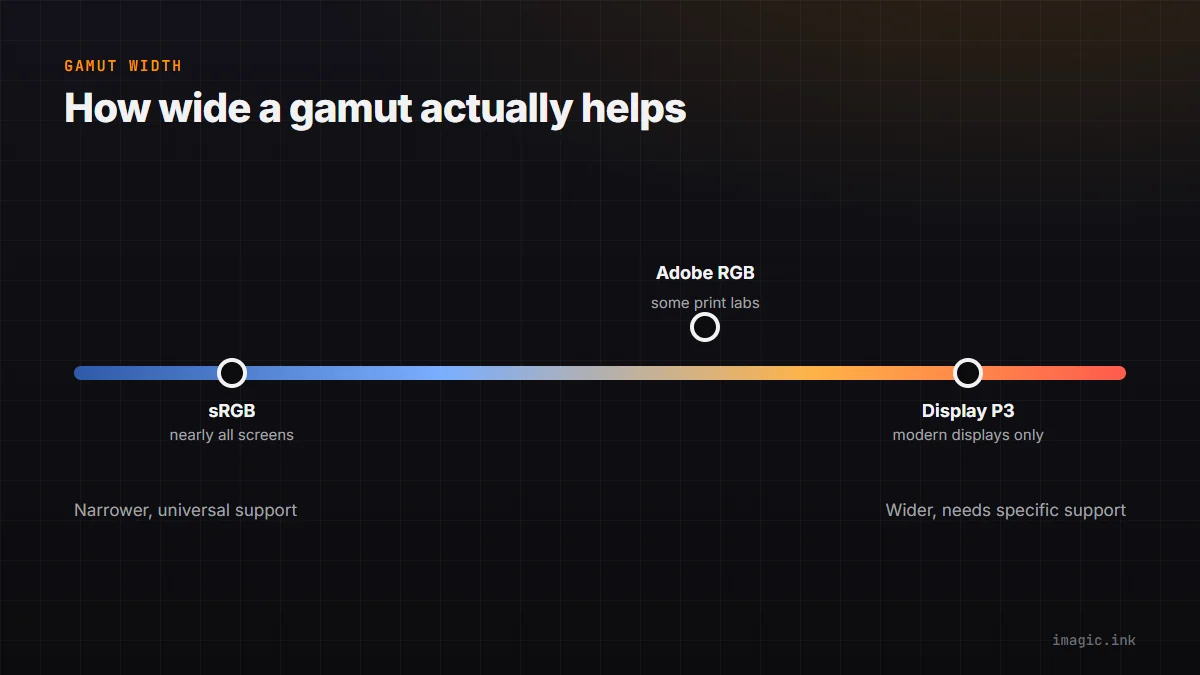
Almost every consumer screen, browser, and social platform assumes sRGB unless told otherwise. That includes most phones, most laptop displays, and essentially all web delivery. Adobe RGB and Display P3 are wider color spaces, capable of showing more saturated colors than sRGB, but they only display correctly on hardware and software that specifically supports them, and only if the file is tagged correctly. Web delivery is the overwhelming majority case for photographers, which is why sRGB remains the safe, boring, correct default for anything a client will view online.
When Wide Gamut Actually Helps
Wide-gamut spaces earn their place in specific situations: high-end print work through a lab that explicitly requests Adobe RGB, delivery pipelines where you know the downstream software and hardware support Display P3 (some modern editing and viewing software does), or working files during editing itself, where extra gamut headroom before you compress down to sRGB for delivery can help avoid clipping saturated colors early. What wide gamut does not help with is a normal client gallery, social media post, or website, where the extra color range is invisible at best and actively wrong-looking at worst if the file is not converted properly.
The Mismatch Symptom: Dull, Flat Exports
The classic mismatch symptom is an export that looks correct in your editor but noticeably duller, sometimes almost desaturated, when opened elsewhere. This happens when a file is tagged Adobe RGB (or has no color profile at all) and gets displayed by software that assumes sRGB without converting it. The colors are technically still there in the file, but they are being interpreted incorrectly, so saturated reds and greens especially collapse toward flatter tones. It looks like an editing mistake; it is actually a tagging and conversion mistake.
A Safe Default Policy
Edit in whatever space your software defaults to, but convert and tag every export intended for web or client viewing as sRGB, no exceptions, unless a specific print lab has explicitly requested otherwise in writing. This single rule prevents the vast majority of color mismatch complaints. It costs nothing in quality for the 95%+ of images that end up on a screen, and it removes an entire category of "why does my photo look wrong" client emails.
Frequently asked questions
Should I edit and export photos in sRGB by default?
For anything headed to the web or a client's screen, yes. sRGB is what almost all consumer displays and platforms assume, so exporting in it avoids the dull, desaturated look that comes from a color space mismatch.
When should I use Adobe RGB instead?
Mainly for print workflows where a lab specifically requests it, or as a working space during editing before a final sRGB conversion for delivery. It is rarely the right choice for a file a client will view on a screen.
Why do my exported photos look duller than they did while editing?
This is usually a color space mismatch: the file is tagged in a wider gamut than the viewing software or display assumes, so saturated colors get misinterpreted and appear flatter than intended. Converting the export to sRGB typically fixes it.
Related: HSV/HSL color correction and reading a histogram for exposure. Color consistency matters most for product photography delivered digitally. More in Guides.